High-performance builds
Our development team delivers optimal page load speeds, ensuring the best conditions for SEO and UX.
Build a website that aligns structure, content, design, and user experience to generate leads and sales opportunities.

Our development team delivers optimal page load speeds, ensuring the best conditions for SEO and UX.
We replace confusing corporate speak with clear messaging—and convey the complex with welcome concision.
We make the website the center of your SEO strategy, baking search optimizations into every component.
Our designs look great and function well for years, giving your brand the home it deserves on the web.
Every website we build works beautifully no matter what device or screen size it’s viewed on.
Need a custom tool or capability? We’ve built custom web tools to tackle a variety of needs.

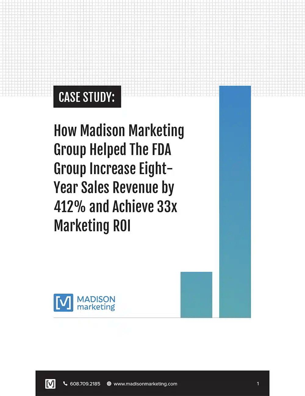
“I would like to share with you my absolute pleasure in working with your team. They are extremely responsive and their output is amazing. They are very collaborative and definitely think about what they are doing to optimize results.”

Nick Capman, CEO
The FDA Group